

WRITER | SARAH SPOHN
Choosing a color for your home’s interior living spaces can be overwhelming. With shades and tints of every color under the rainbow, how does one fearlessly pick a paint swatch without hesitation or regret? Interior designer Kat Moore says consumers should think about what colors make them happy and craft a room after those hues.
Moore studied art history, interior design, and photography in college, worked in Klingman’s Furniture’s design studio, oversaw floor room displays, designed at La-Z-Boy, and even worked in Hawaii. Although she had an entire class on color theory, Moore says the basic interior design principles can be applied to any home and homeowner, regardless of their background.
To start the process of choosing a paint color, she suggests gathering inspiration from Pinterest boards and analyzing the designs, concepts, and photographs for design consistency. Another good starting point is to find an existing piece of furniture, accessory, or artwork that you love and use that as inspiration for colors to use throughout the space.
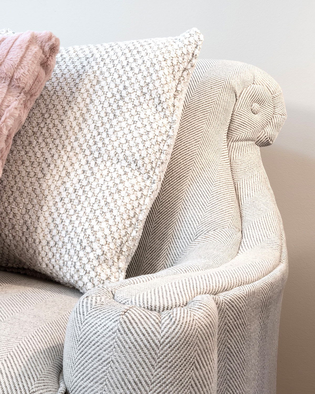
For many, using a bright pop of color for wall space is too risky, so most consumers opt for neutral paint, which acts as a grounding element. Over the past few years, grays have been a popular go-to instead of traditional white walls. Benjamin Moore’s Revere Pewter and Sherwin William’s Agreeable Gray are both popular options, according to Moore. “They’re nice chameleon colors called ‘greige,’ where gray meets beige. They can lean either way, going toward the warmer beige or pulling to the cooler gray spectrum.”
It’s also important to survey color choices under different lighting, as daytime and artificial light vary depending on the time of day, drastically altering the color you see. Making sure your palette’s undertones are cohesive and complementary in settings with variable light will help you avoid mismatching or clashing colors.
“It’s nice to have a lighter, neutral palette throughout the home,” Moore says. She recommends “using your accessories for color pops,” providing a fun, hip twist without a large commitment. She encourages neutral colors for timelessness in larger investment pieces such as flooring, countertops, and tile. “It used to be that people would install pink or hunter green countertops, and it really dates the room. I think of it like buying a nice, expensive suit. You can then change your scarf, jewelry, or shoes in the same way you can change out your accessories.”
Even if it’s not committing to a colorful accent wall, swapping out accessories like throw pillows is a great way to experiment with various palettes and moods. Moore believes in the power of a throw pillow, which can elevate a space and showcase your personality. “Say you have a neutral light gray sofa, you can pop oranges on it for fall, red and green or blue and silvers for a winter palette, changing the whole feel of your room with throw pillows.”
Another trick for trying out a bright, bold color without having to buy multiple gallons of paint is transforming the first thing people see when they walk into your home: the front door. This focal entry point can really set the tone for your entire home’s style. “I think having your door be a really fun color like a bright red or yellow isn’t so scary,” Moore says, “but people can get a fun splash of color that can be uplifting and vibrant.”
Bringing in colors from the exterior of the house, weaving them throughout the interior space is also a good rule of thumb for creating a cohesive color palette, says Moore. “Perhaps you have a gray house with a blue door; repeating these colors in your interior can be a unifying design element. It’s nice if you can bring the outside in.”
Oddly enough, interior design color trends are often inspired by the automobile industry. For the past 20 years, there’s been a Pantone Color of the Year, influencing product development in fashion, home furnishings, industrial design, packaging, and graphic design. Pantone Color Institute experts chose Pantone 17-5104 Ultimate Gray, a solid, natural, pebble-like gray, and Pantone 13-0647 Illuminating, a cheerful shade of yellow for 2021.
Ultimately, choosing a color palette for your home is very much a personal preference, says Moore. “Create your own style, and then it never really goes out of style. Don’t be a follower of the trends; create something that is unique to you. I think that’s something that’s more lasting and will bring people more joy.”