

WRITER | CARRIE BLANCK
PHOTO| ASHLEY AVILA PHOTOGRAPHY
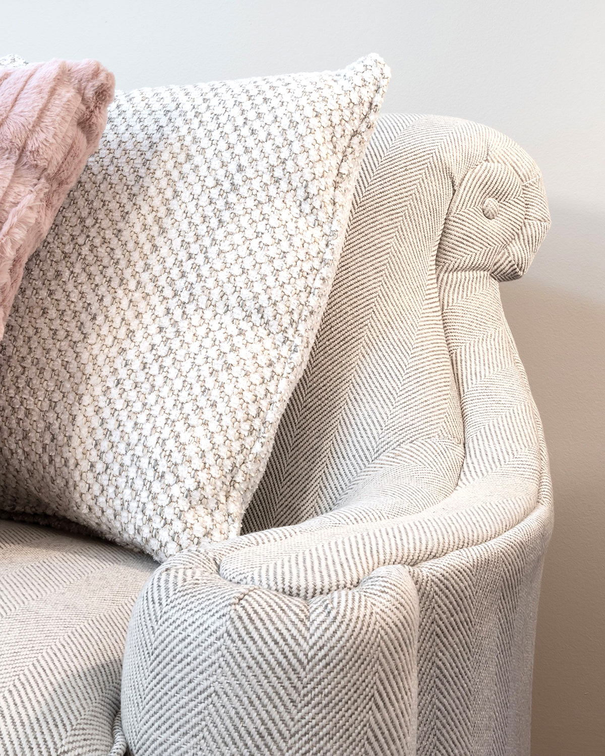
Color evokes emotions, feelings, and moods with its ability to transform an ordinary space into a one-of-a-kind venue. It’s found in art, rugs, fabrics, and furnishings, and becomes fundamental in your design choices, direction, and selection.
Often, design inspirations stem from the natural colors outside our homes. The beautiful scenery, such as the various blue hues of our summer skies and the surrounding lakes, influence many homes. Capitalizing on the picturesque landscape allows those natural outdoor colors to transition to the inside of the house seamlessly.
By using a common thread of color throughout the house and playing off the tones in the main living space, a harmonious palette ties the entire project together. The color theme can be used as an accent, or the color value may be tweaked to accentuate a piece of art or another object.
When selecting colors, it is essential to test hues and look at fabrics where they will be used in your home before making a final decision. Lighting, both natural and artificial, can change our perception of the way they look. Sunlight reflecting off the lake or snow and the type of lighting fixtures and bulbs used can dramatically alter their appearance.
Keep in mind that paint colors are not for walls only. Ceilings can be an unexpected place to add interest, and subtle colors on a ceiling can add a finishing touch to a room. You can use your wall color, an accent color, or a lighter shade of your wall color (50 percent, for example), which creates a gradual fade. In my opinion, this ceiling detail should be subtle, something that is noticed only after you have been in the room for a bit.
Surprisingly, perhaps, your most important color choice may be “Which white?” Although many don’t consider it to be a color at all, there are actually many shades. Selecting a white with a warm undertone could create dirty-looking trim if paired with the wrong wall color. Whites with blue undertones can appear almost fluorescent, and there are whites that look dingy when paired incorrectly. Most designers have two or three go-to whites that optimize the overall color scheme of a room. In Northern Michigan, white is often used to paint the entire inside of a home, especially if the home is primarily some sort of wood paneling, beadboard, board and batten, or nickel gap paneling. White adds a fresh backdrop for any color of furniture, window treatment fabrics, lamps, rugs, or art.
An additional way to add an element of surprise with color is to paint the inside of your front door. Doors do not always need to be stained wood or painted white. In my own home, my front door is a fun shade of aqua, which complements some of the shades in my living room fabrics. This unexpected pop of color unifies the foyer area with the rest of the home.
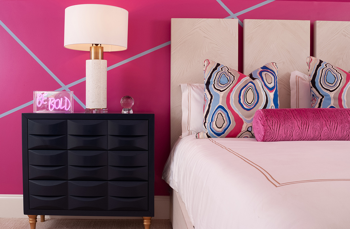
Powder rooms provide an opportunity to have fun with a blast of color. Often, this is a room where daring design choices can be used. Think of the powder room that your guests use as the jewelry box of your home. Wallpaper with a bold pattern or vivid color can envelop the space. Painting the vanity cabinet, mirror, or light fixtures can add flair. Because this is a smaller room that is visited briefly, design choices can be bold! It’s a room where you should splurge a little on the details, like selecting unique faucets, cabinet hardware, or wallpaper.
It’s hard to live with color that you do not love. It’s best to keep a home within your favorites. If you’re a blue person, embrace it! The same is true with all colors; if it appeals to you, you will be comfortable and relaxed and love your space!