

WRITER | LIZ JERORE
PHOTO| @HOME CABINETRY & INTERIORS
Today, professional designers see a trend in homeowners wanting to simplify and calm their homes. We live in a very disruptive age, with electronic devices constantly demanding our immediate attention. Life seems to have sped up, and many express the need to unplug after work and escape to a sanctuary-like home.
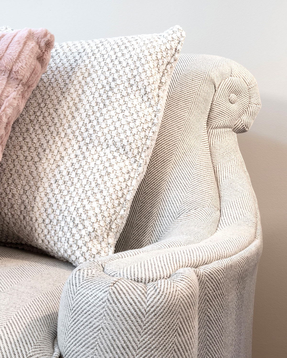
In response, designers are paring down the use of high-contrast colors and multiple patterns in every room of the house. The trend is toward a more neutral canvas, with solids or textured fabrics used on large pieces of furniture and patterns then layered on with accent pillows, area rugs, or a strategically placed wallcovering.
While you are exploring fabrics and color, always consider the use or function of the room and the mood you wish to create. The use of soft neutrals, mid-range colors, and gentle patterns helps to control visual noise and therefore calms the environment. Alternatively, an exuberant color palette with multiple active patterns will bring life and energy to a room.
When it comes to mixing patterns, it’s important to trust your instincts about what looks good and feels right, however here are a few basic tips that may help point you in the right direction:
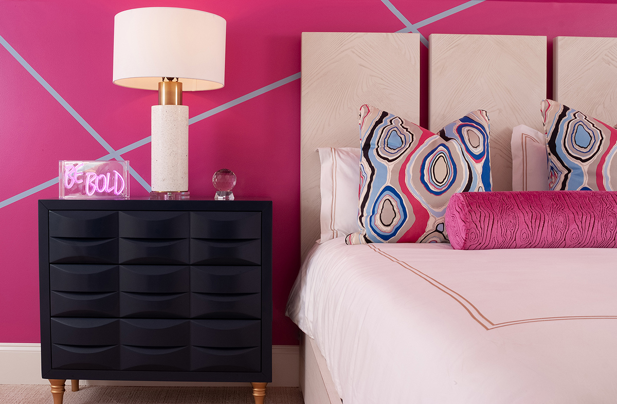
- Think Three: Use at least three patterns in a room and vary the scale. One large, one medium, and one small. Odd numbers are more interesting and just seem to make things work, whether you are mixing patterns, combining colors, or planting shrubs.
- Fabric 1: The primary pattern will often be the largest scale and will make the strongest statement in the room. This should be the pattern that really speaks to your personal sense of style. The primary pattern might be an area rug or bedding that you absolutely love!
- Fabric 2: This should be half the scale of the primary fabric. Example: If the primary fabric has a 10-inch flower for instance, the second fabric’s main motif should measure about 5 inches.
- Fabric 3: The third fabric should be smallest in scale, such as pinstripes or texture. – STACI is the period blue? Please fix
- Use patterns that have colors of the same intensity. For instance, don’t mix pastels with jewel tones. Patterns that share the same level of saturation will work together more easily.
- Position patterns evenly throughout the room. If the majority are all on one side of the room, the whole space may appear off balance.
- Combining patterns of many different colors will create energy and bring a playful or less formal feel to your room.
- Tone-on-tone patterns often calm a room and provide an elegant depth of character. They can also bring a sense of space to a modestly sized room.
- Consider the tone you wish to create in your room. A big cabbage rose sofa with checked pillows has an entirely different voice than a checked sofa with cabbage rose pillows. Placement of the pattern makes a big difference!
Remember, the most important rule when mixing patterns is to show a bit of restraint. Don’t place too many patterns on top of each other. A dynamic combination is exciting, but be sure to layer in solids. Patterns need room to breathe. The eye needs a place to rest, and too many patterns will feel chaotic.
Finally, once you have collected your ideas and samples, you may wish to show them to a professional designer before making your purchases. Most are available by purchasing a block of consultation time, and designers can save you time, money, and alleviate anxiety!