

WRITER | JULIE HOLMES
Color is usually one of the last decisions made when designing a home, but it’s also the one that will bring all of the other elements together. It reflects what we love and who we are, and it has a great impact on how we feel in a space.
In a departure from Ultra Violet, 2018’s rich, dark color of the year, the color experts at Pantone have chosen the bold and lively Living Coral for 2019. “The Pantone Color of the Year has come to mean so much more than ‘what’s trending’ in the world of design; it’s truly a reflection of what’s needed in our world today,” asserts Laurie Pressman, vice president of the Pantone Color Institute.
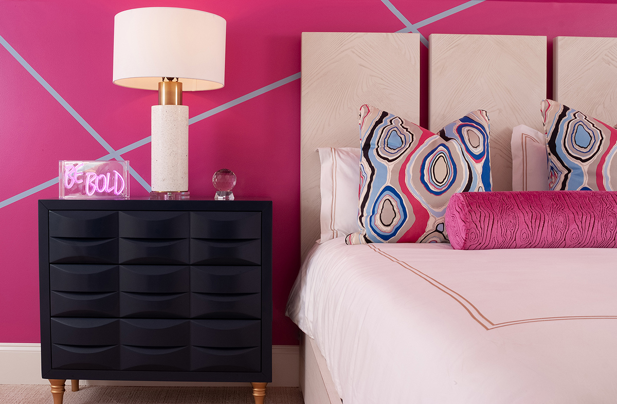
Living Coral brings a sense of optimism to 2019 and is a universal color. While it may seem daring, coral is a color that looks good on everyone and therefore can look good in any design and space. It is a fun color to be challenged within designing a space. You can go bold and use it for a wall color, or add it in as a pop of color to pillows or accessories that can always be refreshed should you be ready for a different shade or a more neutral tone. Coral is a versatile color. It can be toned down by using it with navy and other strong, dark neutrals or heightened by adding it to pinks and oranges. Don’t be afraid to add a touch of this bright tone to any room for a bit of playfulness.
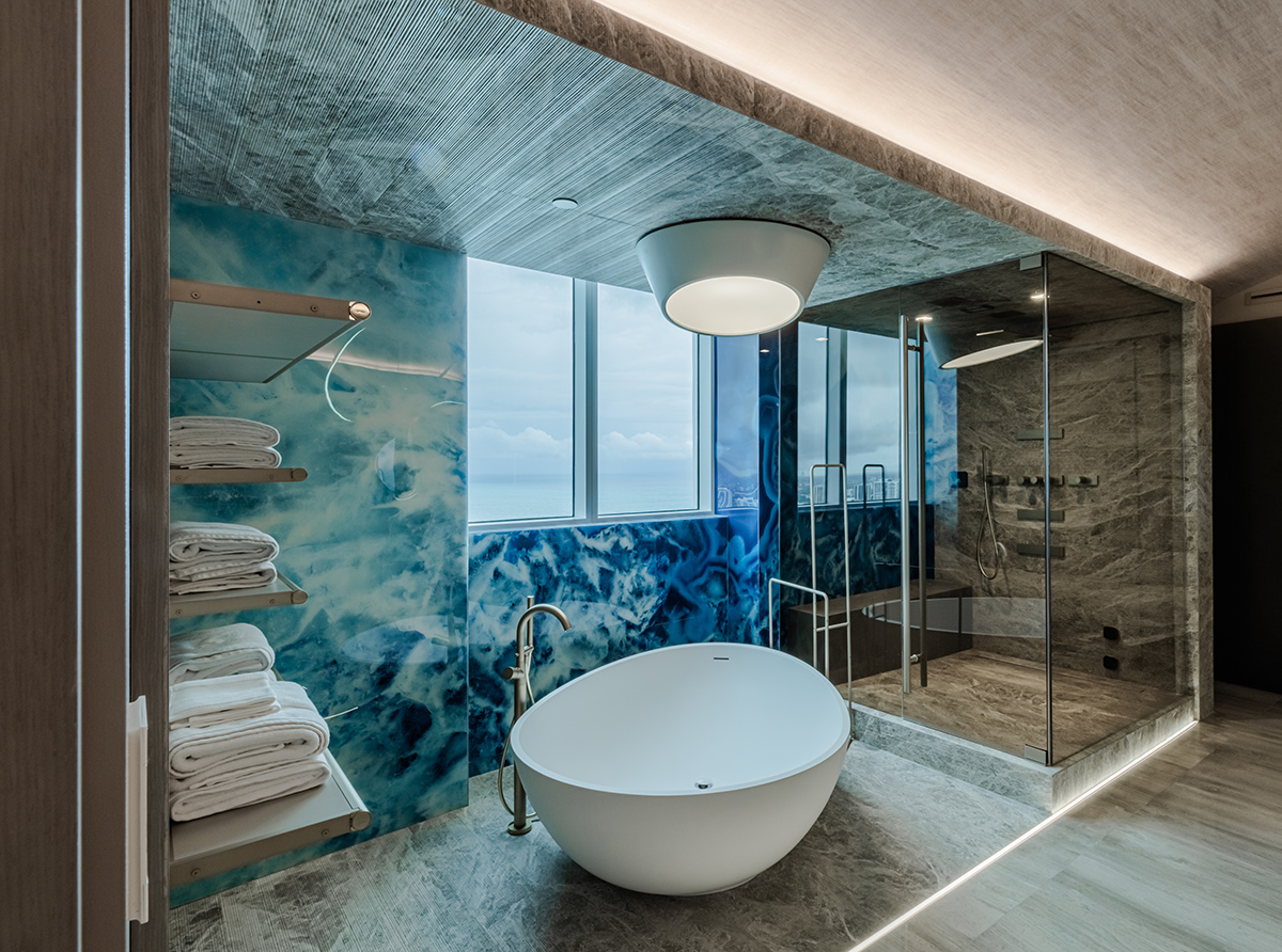
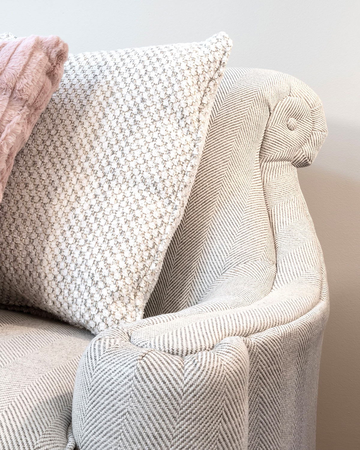
Another color trend for 2019 will be the continuing use of pale colors and soft pastels, which are easy to fit into multiple styles. They can offer a soothing look for a bedroom or living space and can be kept quiet with a tone-on-tone, monochromatic look. They are easily modernized with the addition of metallic golds and silvers, or they can be made loud and bold by combining them with black lacquered accents. Soft pastels will help to maintain a neutral, airy look but will give just a hint of color, or serve as an excellent backdrop to add bolder color in accessories or furniture.
A continuing trend from 2018 will be dark, painted woodwork in tones of green and brown, which lends itself to a sophisticated Transitional feel. It serves as a softer, warmer alternative to black while maintaining the richness and depth of the darker tone.
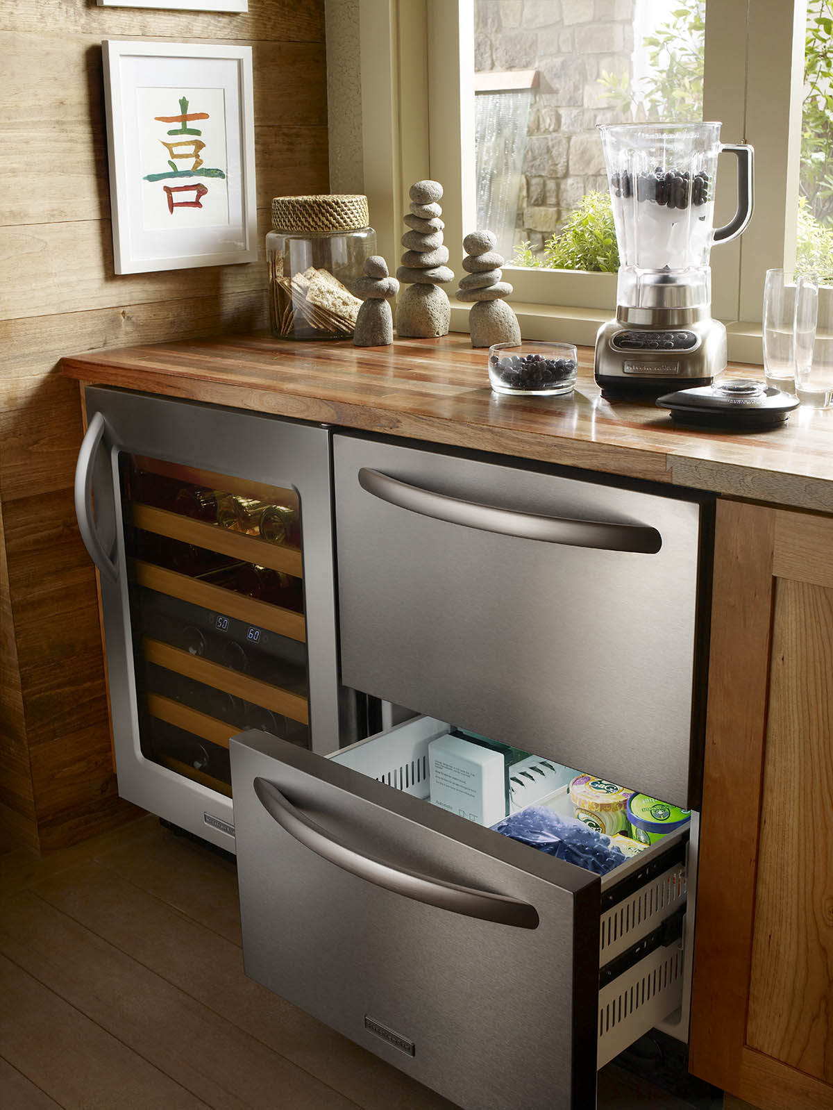
Light, dark, and bold colors can be incorporated into any room. Consider how you want to live in and use the space before determining if a bright color is right for you. If you want a space to feel calming, choose a neutral shade; if you want to be energized by your space, go bold. If you are hesitant to go bold on the walls, consider a colorful cabinet or vanity, adding a wallpaper with a pop of color, a patterned pillow or fabric, or even colorful vases.
As we see trends in color shift from year to year, the best choice for your home will always be the colors that create a space where you want to spend time. If you choose a neutral palette for walls and furniture, accent colors can be altered to reflect a new trend or a change in personal style. Your home should always be the space where you feel the most comfortable. Trends come and go, but timeless design is forever!