

WRITER | LINDA RICHTER-CLUTTER
PHOTO | WITBECK & BIG GEORGE’S HOME APPLIANCE MARKET
Every year, paint companies and color experts showcase their interpretation of color trends for the upcoming year. For 2022, the trend points toward renewing our spirits and restoring our connection to nature via soft greens. Paint companies often draw inspiration from fashion, the environment, cultural trends, and design influencers when selecting a color. Sage green is reflective of our times ― renewal, healing, and calm ― just what most of us are ready for. Each company creates a unique name for their choice, such as October Mist by Benjamin Moore, Olive Sprig by PPG, Evergreen Fog by Sherwin Williams, or Breezeway by Behr, evoking natural images and organic undertones.
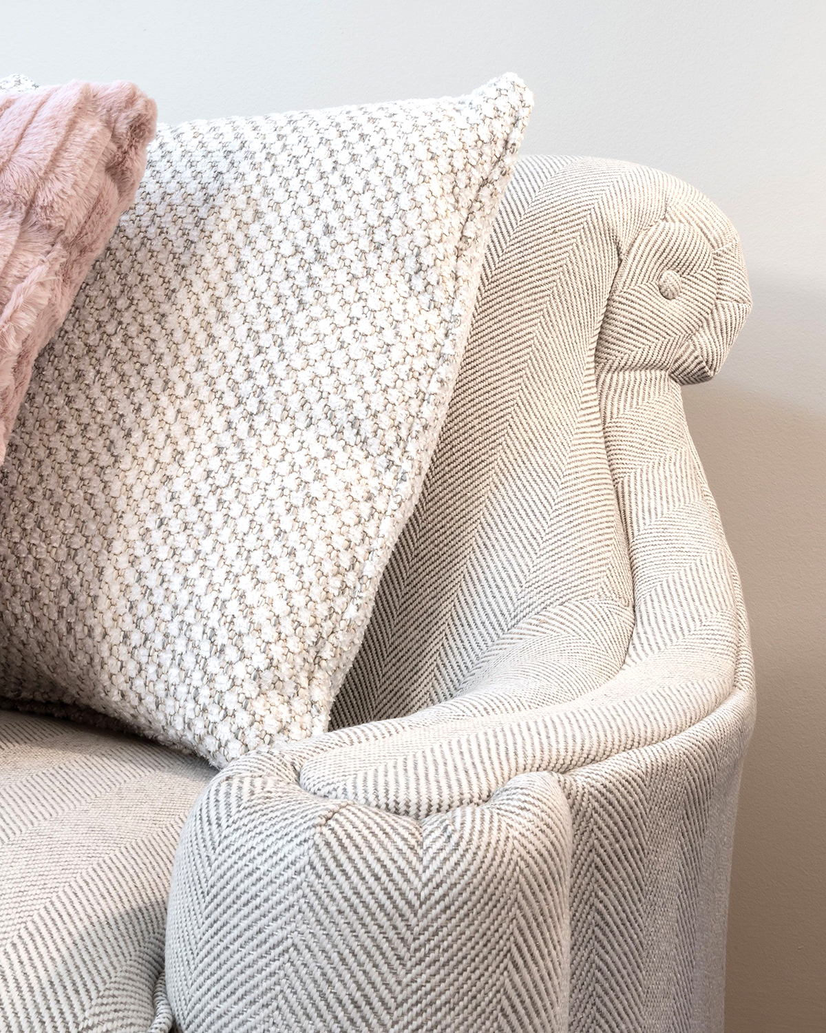
Picture nature-inspired colors that pair well with light and medium wood tones, warm taupe, and creamy whites creating a comfortable, relaxing setting, much like walking in the woods on a misty, warm summer morning. These colors can be combined with dark shades to add warmth and depth or combined with a cool blue-green for a crisp, clean look. For a dramatic design look, pair with a dark blue-black for strong contrast that adds dimension to a dining room.
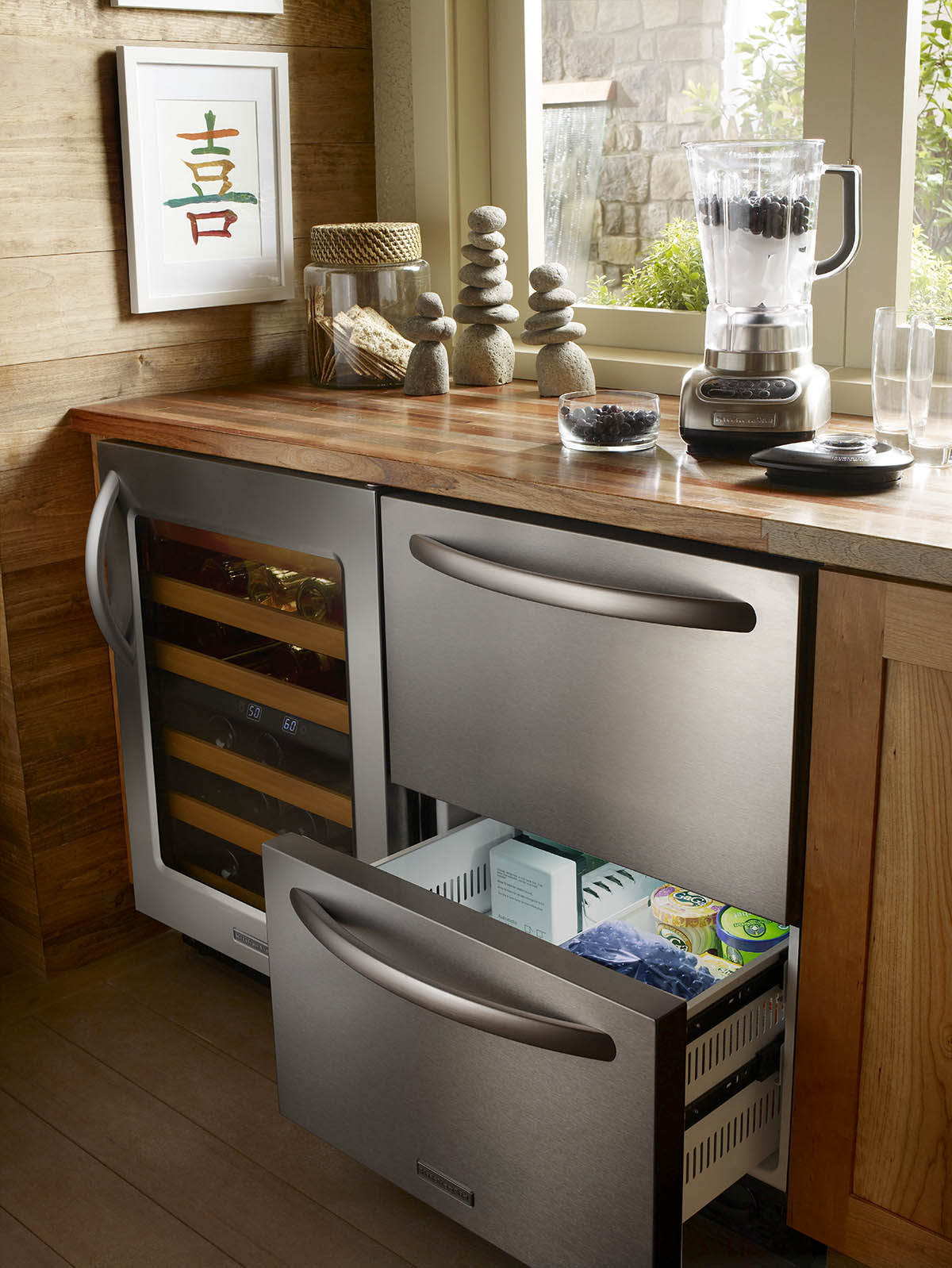
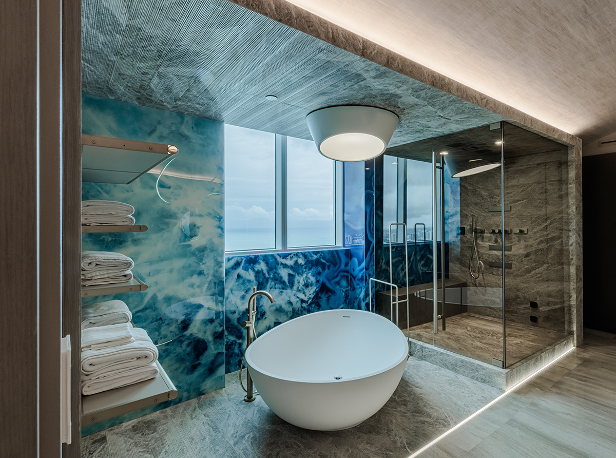
This mid-tone soft-green color palette represents a shift from the recent cool neutrals and jewel tones. This organic color family can establish a calming feeling in bedrooms, tranquility in a bathroom, and healing energy in kitchens and general living areas. Mixing these colors with metal finishes like warm brass, light gold, and matte black creates layers of interest that add energy and a bold design statement without overpowering a room. Warm brass pendants, accent color on an appliance in the kitchen, or beautiful matte black fixtures in a bathroom with warm wood tones can blend beautifully with the hundreds of green shades that paint companies create to bring harmony to your home. Both bold and subtle design features blend flawlessly with this color palette.
Research shows that natural color schemes that fall in the organic category reduce stress, increase productivity and creativity, and may make us happier. Isn’t this what we all want in our homes as more time is spent creating indoor and outdoor spaces that blend?
Trends always come and go, but these days people seem to be comfortable blending styles to show personal expression, and style lines are becoming somewhat blurred as a result. The term “eclectic” has appeared in design magazines for years. Once somewhat frowned upon, Eclectic is now a recognized design style.
In addition to the calming greens coming out for 2022, Pantone has created a new color for the year that is quite different from sage green: Very Peri, a soft blue-purple periwinkle. Most years, paint companies and Pantone are aligned in their color choice. Very Peri is meant to represent creativity and curiosity, “an altered landscape of possibilities, opening us up to a new vision as we rewrite our lives.” Although the 2022 colors are very different, both sage green and Very Peri attempt to address the overarching desire for a fresh start and possibility.